Pages

Thursday, September 27, 2012

Lighten Up!


 The last time I was at the craft store, I found a copper patina kit in the clearance aisle. I've been curious about these kits for a long time, so I couldn't resist! There are two parts to the kit: a paint which contains real flakes of copper, and a solution which corrodes the copper flakes.

I made my lantern out of heavy paper/thin card stock.
 Originally, I thought I would make a working door for the lantern. But I ran into some trouble with the hinges, and ultimately decided to glue the lantern's door closed. The little latch on the right does turn though!
I added 'old' glass to the windows, a candle, and a ring to the top to finish it off. I'd just added the ring when I took this picture, which is why you can see that bright white spot of glue!

Friday, September 21, 2012

Having Fun with House of Miniature Kits

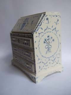
In between making tiles, I needed to take a break and make something different. I decided to put together a House of Miniatures desk kit. It seemed only natural to paint it blue and white.
 
Whenever I had to pause to let another batch of tiles dry, I would pull this desk out and add a few more flourishes.

 I knew I wanted to use a different color on the inside of the desk and drawers. I went back and forth between a pale terracotta red, and sage green ,but ultimately decided I liked the softer look of the green better.
There are still a few things for me to finish up. I need to add the hardware, (the white pulls on the drawer were a temporary experiment), finish out the inside of the desk with a few cubbies and more decorative painting. I'm also on the fence about whether or not to age the desk. At the moment, I'm leaning towards adding a few scuffs and darkened corners, but I'll hold off until I'm sure. What would you do? Would you age it, or keep it as is?


Wednesday, September 19, 2012

Hundreds of Tiles Later...


Last time I promised to show my dairy project when I finished the tiling the walls. Well, it only took me about two weeks and 650 tiles!  Let's just say that I won't be using tiles again anytime soon.The tiles I chose aren't really appropriate for a dairy (they are much too elaborate) but I figured that for all the work of the room, I might as well use tiles I really liked.
There's still a lot to be done in the room, but the basic shell is finished. 
Please forgive me if this post is a little picture heavy. I'm so happy to be done with the tiles! I made so many tiles I thought for sure there would be extras, but I only had four border tiles left over at the end.

The stone floor is made of paper clay. It's looking a little too brown with all the blue and white. I may repaint it a little more grey.
I was very worried about keeping the tiles straight, so I tiled the walls first,and added the floor after. I made the mistake of gluing the door in first, and it ended up a little too far to the left, which made problems with the fit of the tiles. You can see that I had to add a tiny strip of partial tiles to the right hand corner to fill in the gap!
I'm still working on the door. I just repainted it slightly creamier white, and still need to add some subtle aging. I also need to add some sort of door latch or knob. The hinges I made out of thick paper. I was going to paint them to look like iron, but once I got the stone floor in I thought black hinges would look too dark in the room.
I also used my brother's pocket knife (don't tell him!) to widen the cracks between the boards. The "moulding" I used to make the door casing is just two pieces of layered cardboard.

The gallery room box I took apart to house my dairy had a really terrible gold frame. It was painted three different shades of gold, some matte and some shiny. But the paint job was hiding a decently shaped frame. So I taped off the inner most bands of beading, protected the inside of the box with a  piece of cardboard, and sprayed the frame mat black. I couldn't believe the difference it made!
Before...
After!

Sunday, September 9, 2012

Feeling Blue (and White)

 I've been working on another project for the last week or so. For a while, I've been unhappy with the look of my gallery roombox, which sits on my worktop. I really threw the box together, and some of the shortcuts I took looked really bad. It was also in constant disarray. Usually, it had more paintings waiting to be hung than actually on the walls. It was definitely time for a change.

Since the gallery roombox idea hadn't worked out, I decided to try something completely different in the same box. I decided to make it into an old-fashioned dairy,with tiled walls and stone floors, such as you might find on an old English estate! I'm taking a few liberties with the design, but hopefully it will capture the feel. 

I'm not going to show the room yet. Suffice it to say that I have a long way to go. I'm still working on tiling the walls, and I'm undecided about the best way to get the look I want for the floor. In the mean time, I thought I'd show how I'm making the tiles...
First, I found images of old tiles I liked online.I re-sized them to be 1/2" square (the border tiles are 1/4" by 1/2") and fiddled with the colors until the tiles were approximately the same shades of blue and white. After that, I printed the tiles on watercolour paper. This particular pad of paper had a little too much tooth for my miniature paintings, but the heavy texture creates a realistic ripple effect in the tiles.

Next, I needed to create an easy system for "glazing" my tiles. I glued plastic 'pony' beads to a sturdy old piece of cardboard. I spaced the beads approximately 1" apart. Once the glue had dried, I placed tiny pieces of poster putty (aka blu-tack) on each bead. You can see the green putty on the bead in the background.
After that, it was a simple matter to cut the tiles apart one by one and stick them on beads. I used a drop of gloss medium to 'glaze' each tile, and let them dry for a few hours.When they were dry, I glued the tiles to another sheet of watercolour paper, using a square to keep the rows relatively straight.