With the Sturbridge Show just a month away, I've been thinking a lot about how to display certain things. While picking up a few things we genuinely needed for the show, I saw a little cardboard box that was the perfect size for displaying a few small miniatures, and had to buy it as well.
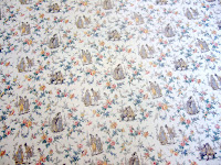
I used a sheet of wallpaper that I bought ages ago to paper the inside of the box. The paper is Society Garden from MiniGraphics.
I'd bought the paper because I thought the design was too pretty to pass up, but I never liked how bright the colors were. I gave the wallpaper a wash of coffee to tone it down. You can see wheat a difference it made! The floor is just a piece of full-scale wallpaper that was printed to look like chipping paint.
Once the box was papered, I had to play a bit. I pulled out a lot of different miniatures, but this was the combination that I liked best. The original post on the love letters can be found here. I thought I'd written about the watercolor and table (both of which I painted) but it doesn't seem so.
This grouping was just for fun, since we're planning to fill the box with completely different items for the show. But I loved having the excuse to pull out old projects and try them in new combinations. I'll post more on the box itself another time!


I love the grouping of these lovely items in the box and love the effect of the coffee wash on the paper. The painting and little table are gorgeous.
ReplyDeleteIt is really nice to play with different scenes. It means so much how furniture and accessories will stand together. It is a fine scene you have made.
ReplyDeleteHugs
Wyrna
Hello Eliza,
ReplyDeleteI love to see a fellow child at hear6t who loves to play. The paper really came out beautiful.
Big hug,
Giac
Dear Eliza,
ReplyDeleteThe coffee works out well. Not only to drink but also to paint. Your paper looks better this way. Thanks for sharing this idea.
Hugs Dorien
Hi Eliza! It's a lovely little scene. Thanks for the coffee tip!
ReplyDeleteyes thank for the coffee tip I have some bright paper that I need to tone down a bit..I love playing with scenes too..I can't wait to see what else you play with :)
ReplyDeleteHugs
Marisa
It's a very romantic corner. I like the wallpaper.
ReplyDeleteBye, Faby
That corner really DOES look romantic. Very nice!
ReplyDeleteHi Eliza! I agree, the paper is sooo much prettier with the background toned down! It is a lovely pattern, very soft and romantic!. I like the way the little corner table fits in and the framed picture. The entire scene is delightful!
ReplyDeleteelizabeth
Prachtig behang en een heel mooi hoekje. Romantisch die brief met de roos erop.
ReplyDeleteGroeten Xandra